screenprinting

Different Types of Screen Printing Techniques

31A388A2-3469-40DF-B89A-9D7A12E8FFD8.jpg

Screen printing might sound like it’s a straightforward process but there are many print effects that can be achieved with the right technique. The different screen printing methods are used to create a specific look to fit with the style you’re looking for. In order to achieve certain looks, you may need to adjust your artwork file or overall design. Don’t worry, we will take you through those steps!

In this guide, you will find the best T-shirt printing methods explained, exploring how each method works, the process, and the end results. Each of these methods are widely used by screen print shops around the world.

About Screen Printing

IMG_8615-2+%281%29.jpg

Screen printing is one of the most popular, established, and widely used amongst print shops. The process involves using screens to apply ink to apparel and other various materials. Also known as silkscreen printing, screen printing is a versatile and effective printing method that allows you to produce T-shirts with outstanding quality and a tactile feel. And, because the inks are absorbed deeply into the fabric, it is possible to achieve vivid, bright colors and maximum durability.

This is one of the most traditional methods of T-shirt printing, with experts believing it dates back as far as ancient China. However, it became popular in the 20th century, when Andy Warhol used the technique to create his iconic Marilyn Monroe portrait. It has since been used to create flatstock such as band posters, art prints, and graphic tees.

What Is The Screen Printing Process?

screen-printing.jpg
  • Design Creation

    • Screenprint designs are often done using various software such as illustrator. You will want to ensure your file is in the right format before you begin creating your design. Size is very important and you will want to ensure the file can be re-sized according to the print surface.

  • File Formatting

    • Vector files are needed to create a perfect print. Vector files are mathematical calculations that create lines and figures on our monitors. Unlike working with pixels, you can expand or minimize these vectors as much as you want, without impacting the quality. As well as being saved as a vector, the artwork must also be separated, with each color on a different layer. This is because, in the screen printing process, each tone is printed using a different screen.

  • Screen Preparation

    • The screen needs to be coated with a photosensitive emulsion. This creates the green background you might have seen on a screen printing screen. This is a simple process but must be done carefully to ensure that the liquid is distributed evenly.
      For the photosensitive emulsion to work properly, it must be left to dry in a cool, darkroom. If the emulsion is exposed to light at the wrong time, it could jeopardize the full process.

  • Stencil Creation

    • Once the screen is dry, the design is placed on top of it and secured in place using an adhesive. The screen is then placed under a strong source of UV light. The parts of the screen that haven’t been covered with the design will harden, while the rest will remain soft. In effect, the design has now been burned into the emulsion. When the screen is fully dry, the design can be removed using a small brush and water. A negative component of the artwork will be left and the artwork is ready to be printed using the preferred ink and technique to achieve the right look.

  • Color Separation

    • If your design features more than one color, the process is repeated so that each color in your design is separated into individual layers on different screens. So, if your design has two colors, you’ll need two screens.
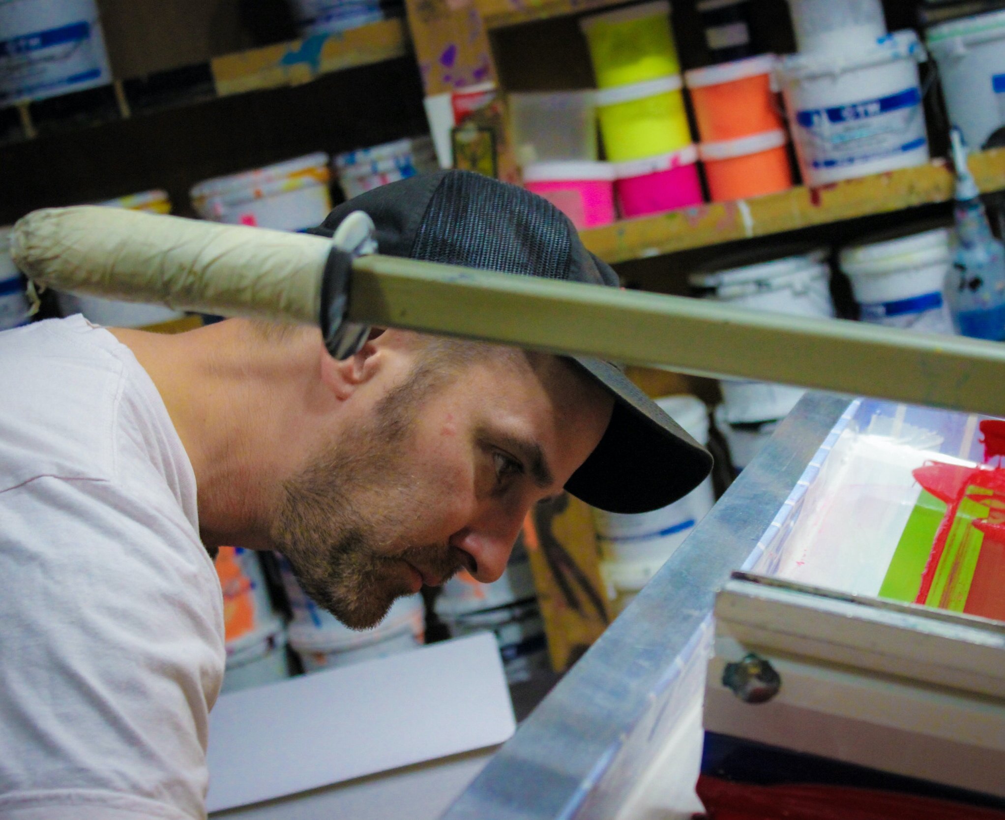
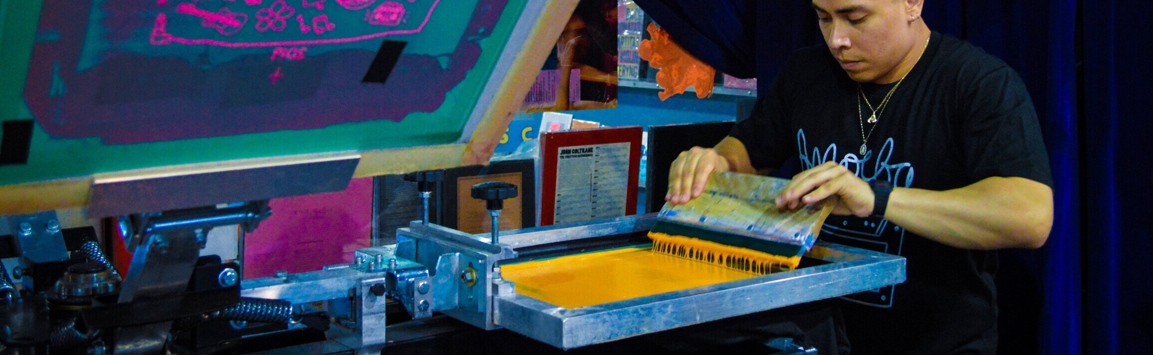
  • Application

    • Now that the screen is ready, it’s time to start the actual printing. The T-shirt will be placed in the screen printing machine, with the screen carefully placed on top. The ink will then be placed on top of the screen and evenly distributed across the surface using a squeegee.

Learn more about the life of a screen from The Metropolitan Museum of Art

What Are The Different Types of Screen Printing?

image.jpg

With screen printing, you can create different finishes such as crackle or glow in the dark, but there are also different techniques that can be done to create a specific look for your print. These different techniques are used when you have a specific look in mind or you’re looking for a specific or unique aesthetic.

Spot Color Screen Printing

Spot Color Screen Printing is the most common t-shirt printing method. It uses the stock color of the ink by printing it through the stencil of the screen. It produces a vibrant solid spot of color and creates a thicker layer of ink depending on the ink and mesh count used.

Being it is one of the most beneficial in printing darker garments. It is useful for printing 1 – 4 colors; when you have more spot colors, other printing methods such as the simulated process may be a good option.

Because spot colors layer an infinite amount of colors, they can provide a much more vibrant and detailed print. In addition to the variety of options, spot colors provide much better consistency from print to print. When printing a solid color with process inks, there may be slight variations in the color balance that can affect the color’s consistency. While spot colors may cost a bit more, they can add a lot to your project making the extra cost well worth it in the end. Check “How To Screen Print: Spot Color”.

Halftone Printing

Halftone prints are single or multiple colors in which gradients are printed. These tones can range from solid spots to halftones of the same color. This screen printing method is excellent when you want to achieve the look of multi-color printing without actually doing it. This screen printing method emphasizes the use of shading with tiny dots, pictures can be printed using halftone screen printing and only use one single color to do so.

For example, if you want to get a pink radiant color on your white t-shirt, you can print red on a white shirt and include a 50% gradient. The 50% gradient will mix with the white to give it a pink appearance, all using only one screen and one color. It improves the graphics quality and produces a softer feeling print when printed directly onto the garment. Check “How To Get Started Screen Printing with Halftones”.

Grayscale Printing

Greyscale printing is a great way to print full-color images as one-color grayscales or halftones. Full-color photographs can be printed as a one-color halftone. Full-color drawings containing a complete range of different colors may also be produced employing a one-color halftone.

Typically it’s done in black ink on a light garment, but technically speaking, it can be done in any color ink as desired. The resolution will depend on the lines per inch used in the dot pattern.

The more dots a halftone has, the more detailed the print will look. It is a great cost-effective screen printing technique to print black and white photographs on garments. Watch “Convert a full color image to grayscale for screen printing using halftones”.

HOW IS HALFTONE PRINTING DIFFERENT THAN A GRAYSCALE?

Halftone printing is different than grayscale printing for several reasons. The first is the fact that halftone printing involves using one color to create various shades and portray the desired image as a result. Grayscale printing, on the other hand, is the specific use of gray shades from black and white.

Duotone Printing

Duotone printing, also known as multitone printing, is the combination of two halftones for the same image printed with two colors. First, a black halftone is printed on white tees, and then a second halftone will be printed with color ink.

The color halftone combines with the black halftone to produce a duotone color hue. It gives a retro and cooling effect to the prints on light-color garments and gives a full-color print appearance but at a much less expensive rate. It also produces a softer feel print when printed onto the garment.

This process requires that the press be set up with special inks, usually PANTONE-designated colors, instead of the standard CMYK inks used for process color printing. Check out “Creating and Separating Duotone Images”.

CMYK Printing

CMYK is the oldest, color reproduction, print method. Using cyan, magenta, yellow and black ink, screen printers can print designs on white or light-colored garments. For users skilled in CMYK file preparation, Photoshop, and screen creation, this is still a viable print process for light-colored garments.

CMYK printing is the most complex of all screen printing techniques and should be done on an automatic press. It can be done manually, but for optimum results, you need an automatic t-shirt press.

The printing process combines the above four colors to recreate the original image’s full tonal and color range. Moreover, it is an expensive process. Additionally, CMYK is implemented less because simulated printing is more dominant. Watch “How To Screen Print T-Shirts in CMYK”.

Simulated Process Printing

A simulated printing process is a method used to reproduce almost any image on the market. It does so by overlapping and blending colors in a method similar to CMYK through using halftones and spot colors and/or PMS colors. Essentially, it's a way of taking an image that historically would have been printed via CMYK but instead uses more opaque ink to create a more stable color and production-friendly ink that can print almost any design for any garment.

Moreover, it is most often the process used to print complex images on black-colored garments. Designs that are too difficult to separate in a vector program, raster images, photographs, complex tonal illustrations, are all doable with Simulated Process. Watch “How to Screen Print: Simulated Process”.

Learn more about the different screen printing methods “CMYK vs. Spot Color vs. Simulated Process Printing”.

Author: Irene Floridia - Content Creator


Share This Article:

Follow us on Instagram and Facebook!

For FAQ, check out our site!

For any inquiries, send us a message!

OR

send us an e-mail at quotes@familyindustriesla.com

Our showroom at 2755 Fruitdale Street, Los Angeles, CA 90039 is open by appointment only from 10 am - 4 pm Monday through Friday.

Screen Printing 101: Techniques

IMG_4835.jpg

So you’re wondering what it would take for you to be able to make your own print? or you’re wondering how Family Industries makes perfect prints? We’ll take you through the steps necessary to achieve a flawless screen print as well as show you how we do it at the Family Industries HQ.

In this article, we will also take you through the different techniques used for specific outcomes and all that will be necessary for you to achieve them which would include equipment and other factors such as time and effort.

How To Get Started

We’ll take you through the fundamental tools you will need to begin this process. Although you can buy ready-to-use kits from websites such as screenprinting.com - you can always find DIY ways to make your own setup.

Check out Create Custom Screen Printing Designs at Home

43429-group3ww-l.jpg

The Screen

Choosing the right screen mesh can be confusing, a 110 to 160 mesh count screen is the most versatile and the most commonly used in screen printing. We recommend that for prints that are up to 3 colors a 160 (61cm) to 180 (70cm) monofilament mesh screen is best, ensure that they have very well made wood frames that have been purchased with the fabric or mesh already attached (pre-stretched) OR you may also use a metal retentionable screen.

Here’s how to make your own screen

press-starter-blue-1-xl_1_500x500.jpg

The Press Set-Up

The screen needs to be placed on the press and squared to the shirt board. This is as simple as placing a t-square under the frame and looking through the screen to square the image on the frame to the edge of the board. Now when you make a print it will be straight to the board.


green-galaxy-cryocoat-gal-min-xl_1_500x500.jpg

Emulsion

A big part of the photostencil phase of the production cycle, screen printing emulsion is the light-sensitive liquid or capillary-direct films that you coat or adhere to the degreased screen fabric prior to taping your film positives in place.

There are a few choices to pick from when it comes to getting the right emulsion and it has to do with certain variables. Learn about what type of emulsion you will need according to your setup and experience level.

printing-ink-500x500.jpg

The Ink

Most inks on the market are too thick to print easily by hand and they generally need a slight amount of reduction – or thinning – to make it work better. Thinning does not mean making it softer it means adding a curable reducer rather than a "soft hand" additive. A small amount of reducer will make the ink more workable.

If your print is a three-color print, it is recommended to thin the lightest colors a little more than the darker colors. This will generally be the first color in your print and it needs to penetrate into the garment more than the others, this way, it will not pick it up on the bottoms of the other screens. If black is your last color, you can thin it less. It needs to lay on top of the other colors and it will blend in with the under colors if it is too thin.

Plastisol ink tends to get a little thicker when it isn't in use, so you should always stir the ink before you begin thinning it. By stirring the ink you will find out if it really needs thinner. We recommend an ink that is smooth and creamy to one that is so thick that you break the stick trying to stir it.

Beta-Chemical-Screen-Squeegee.jpg

The Squeegee

We highly recommend a triple durometer squeegee that has a harder center around a softer outer edge. These give you more control, especially if you have a lot of strength and try to flatten the blade as you make the print (you don't want to flatten the blade). You can also pick up an "old-fashioned" medium hardness blade with a sharp edge and make a great print. A sharp edge shears off the ink cleanly and will make a sharper print than a dull edge blade. If you are a messy printer, you should use the wider 5" handles. These will help keep your fingers out of the ink.

Choose the right squeegee for your screen print job

Techniques

There are technical applications we recommend and we’ll go over details as to how to print once you have your equipment all set up and ready to go.

IMG_6712.jpg

How Much Ink Should I Use?

Depending on how you work, knowing how much ink to use takes time and practice. Some people have a heavy pour but they are able to manage the printing process to avoid making a mess, while others tend to be a little less coordinated. The rule of thumb is to pour enough to get a good amount of prints without running dry, but not so much that when you print it all rides up onto the squeegee handle. It is much easier to put more ink on a screen and harder to take the excess out! Start off with a small amount and work your way up to learning how much is really needed and how much you can handle.

How Do I Hold The Squeegee?

Top Grip:

A lot of printers use the standard “two-hand, top grip and pull towards you” stroke. While this works well, it can cause some problems if you are printing all day long. Not only will the tips of your fingers and thumbs be sore (and may become numb) you may also feel tenderness in your wrists. What this could cause is a repetitive motion disorder known as Carpal Tunnel Syndrome.

Some people can print their whole lives and never get this but to minimize the chances of developing Carpal Tunnel, you can use special ergonomic squeegees that force you to hold a wider handle.

Side Grip:

This technique moves the strain from the center of your wrist to your forearm muscles. Simply hold the squeegee by the side and pull it towards you. This works great if you are a short person or of average height.

Push or Pull?

The answer to this question is based on preference. Pulling the squeegee towards you is the standard method, but pushing it away from you is really a lot easier. When pulling the squeegee you use more of your wrists and shoulder muscles. When pushing, you use more of your body weight to push the squeegee. We encourage you to try both and figure out what is most comfortable.

How Many Strokes Are Needed?

You really only need one stroke if your ink is diluted enough and you’re printing on a lighter fabric. If the fabric is dark and your ink isn’t sticking as well as you’d like, we encourage you to do two-stroke. If you find that two or three strokes are not doing the job, it may be that your ink is too thick and will need to be diluted a bit more.

How Much Pressure Do I Apply?

We recommend that not a lot of pressure is applied as this can cause the print to be uneven, if the ink is the right consistency then a medium amount of pressure should do the job.


In Conclusion

Having the right equipment is more than half of the job - buying the equipment and the ink can get expensive, however, if you have a plan and the right design, you can make up the money quickly and begin to profit from your creations.

Practise makes perfect, many techniques can be mastered by just making mistakes and starting over. So, don’t be scared to make errors and having to start over, it’s all part of the process.

Author: Irene Floridia - Content Creator


Follow us on Instagram and Facebook!

For FAQ, check out our site!

For any inquiries, send us a message!

OR

send us an e-mail at quotes@familyindustriesla.com

Our showroom at 2755 Fruitdale Street, Los Angeles, CA 90039 is open by appointment only from 10 am - 4 pm Monday through Friday.

Printmaking Design Trends of 2023

Graphic design trends are as unforgettable and recyclable as apparel trends, and this is why the two sometimes overlap, especially if you’re a lifestyle brand. Printmaking can be an integral part for all brands and especially if you’re an artist or musician.

A bright yet simplistic mood is brewing in print design for 2022. Print trends across magazines, brochures, packaging and posters will be dominated by bright colors, playful shapes, and novel print finishes.


DESIGN TRENDS

80’s and 90’s nostalgia is back and it’s everywhere from how kid’s are dressing to what brands have adopted as their brand visuals. Within this genre, we see influences from the past with a touch of modern elements.

90’s Retro Design

In 2022, the retro comeback has finally landed on the 90s with the pop culture comeback of The Matrix and Netflix’s Fear Street, ushering in an era of gothic serifs, neon colors and vaporwave landscapes.

we are reexperiencing the 90s through Memphis design patterns, simple emojis and primitive internet frames also known as brutalist design.

Within this genre of design, we see minimalism and simplicity front and center. People want the sense of familiarity coupled with fun abstract shapes that are not overwhelming.

Typography

2022 is bringing more vibrant, expressive, and experimental lettering. In this new era, we expect lettering that pushes the bounds of easy legibility, creating forms that are expressive in and of themselves.

Because this trend is rooted in experimentation and personal expression, the sky is the limit as far as how it can look. Mismatched letter styles, mind-bending shapes and amorphous blobs are all on the table.

All in all, this type of lettering challenges the distinction between abstract shapes and legible letters.

Illustrations

designers of 2022 are taking their inspiration from past pioneers of flat design, specifically the Ukiyo-e artists of Japan’s Edo Period. Ukiyo-e is a style of printed artwork (though it was sometimes painted) using hand-carved woodblocks. Using this technique allows for scenes in stylized flatness.

Simple line drawings are also going to be a standard in printmaking and overall graphic design. These meandering drawings are intensely personal, and the designers of 2022 are injecting their professional work with a bit of their own abstract mindscape.

Doing so can bridge the gap between digital tools and a human touch, creating designs that are approachable.

Collage Design

The collage is almost like the anti-design, as it’s past has notoriously been a signal of low-budget and grungy.

Most notably, this grunge-type print has a physical presence through analog elements such as tape, torn pages and scribbled handwriting - rebelling against the clean, flat graphics of the digital age.

This design style adds more personality and more energy and movement to poster artwork, tickets, and flyers.

By Nejc Prah via nejcprah.com

Bubble Design

Much like puff prints on apparel, bubble design is everywhere. Bubble shapes have an undeniably positive effect, as circles often convey friendliness and levity due to their lack of corners. But unlike the typical bubble fonts and shapes (which often find their way onto products aimed at children), this 2022 trend revels in exaggeration through elongated forms and psychedelic colors which give it a little more grown-up feel.

Author: Irene Floridia - Content Creator


ARE YOU LOOKING FOR A PRINTMAKER?

send us an e-mail at quotes@familyindustriesla.com, or give us a call at 323.227.1547 and we'd be happy to help.

Our showroom at 2755 Fruitdale Street, Los Angeles, CA 90039 is open by appointment only from 10 am - 4 pm Monday through Friday.


Follow us on Instagram and Facebook

For FAQ, check out our site!

For any inquiries, send us a message!

OR

send us an e-mail at quotes@familyindustriesla.com

Meet A Family Member - Nick Perry

Each month we bring you inside our warehouse to introduce you to a member of our Family.

Nick Perry

Nick Perry

Shipping Manager

When most people hear the word “finishing”, they likely assume things have wrapped up. For our Shipping Manager Nick Perry, “Finishing” is where it all begins. Surrounded every single day by boxes, you’d think Nick would go a little crazy, but it’s actually quite the opposite. He handles his work with the type of calm you’d expect from someone who worked on a golf course, but in lieu of a quiet stretch of well manicured grass, Nick works in a bustling warehouse downtown Los Angeles.

Everything we do here at Family Industries starts in a box, and if even one of those boxes is missing it could mean the difference between a job getting done on time or a massive delay. While there’s nothing inherently sexy about handling the day-to-day logistics of shipping and receiving all of our materials, Nick does it all with the smoothness and ease of a well timed jazz solo. Nothing that comes in or goes out that isn’t within Nick’s purview. It’s because of his tireless work ethic and confidence in what he does that we never find ourselves hitting the panic button. There’s a lot of pressure that’s unavoidably placed on the Shipping and Receiving department, as much of our work is dependent on it, but Nick somehow remains cool, calm, and collected. It’s a gift really.

We couldn’t be more excited to finally introduce you to the man behind the boxes: Nick Perry


What do you do at Family Industries?

I'm the Shipping Manager. I oversee all incoming orders and then make sure they are correctly shipped to the customer. I have also been working to help expand our flatstock printing department to accommodate more fine art elements. Most importantly, I bring the donuts on Friday.

What piece of clothing that you own could you not live without?

39010024511_1.jpg

Give me a super soft, raglan style sweatshirt and I'm happy.


THE OVER-SHARE QUESTIONNAIRE


SHOW US YOUR WORK (OUTSIDE OF WORK)!

I'm always trying express a truth, either with straightforward representation or the silliness of the absurd, sometimes using both at the same time.


AND FINALLY,

DESCRIBE YOURSELF IN ONE GIF…

twoferns - Nick Perry.gif

Meet A Family Member - Joe Herbick

Each month we bring you inside our warehouse to introduce you to a member of our Family.

IMG_8639.jpg

Joe Herbick

Head of Print Making

When it comes to having a passion for your work, there are few as dedicated to their craft as Joe. Screen printing has been a part of Joe’s life since he first started screen printing at twelve years old. Most kids that age change passions as often as they change shoe sizes, but for Joe and screen printing, it was love at first sight. Those years of practice have given way to an artist who’s work is beyond compare. His eye for color, mood, texture, and tone is truly awe-inspiring. We often find ourselves staring at Joe while he prints thinking, “if we stand here long enough, maybe some of that talent will rub off on us.” Unfortunately, that hasn’t been the case, but that won’t stop us from staring… Sorry Joe.

Without further ado, we’d like to introduce you to Joe Herbick


What do you do at Family Industries?

I run the flatstock department. We print just about anything that’s flat, but mostly art prints and posters. I’ve worked on anything from fine art to concert posters, and everything in between.

What piece of clothing that you own could you not live without?

Pants. I always wear pants.

At the moment, what are your top three songs?

1. “Neat Neat Neat” - The Damned

2. “The Passenger” - Iggy Pop

3. “So Sorry” - Clarke and the Himselfs


THE OVER-SHARE QUESTIONNAIRE


SHOW US YOUR WORK (OUTSIDE OF WORK)!

JosephHerbick.jpg

This is the last print I completed of my own work. It’s a 6 color screen print with a split fountain on French paper. Size: 24”x36”.

 
7E71F674-27EC-4625-84F8-57E7A97FBF2E - Joseph Herbick.jpeg

This is an album cover/art project I worked on for desert/stoner rock legend Brant Bjork. This was for the 20 year anniversary reissue/remix of his first solo record, “Jalamanta”. We basically spent a weekend in the high desert near Joshua Tree reimagining the original album art from 20 years ago.

I actually made the skull while working at a bronze foundry back in Baltimore. The top of the skull is cast in dyed alabaster, and the bottom section is cast in solid bronze.

I’ve loved this record since the day I bought it two decades ago, and I am truly honored to have been part of this project.


AND FINALLY,

DESCRIBE YOURSELF IN ONE GIF…

Joe isn’t one for gifs, so here’s a super cool gif we found instead…

giphy-4.gif

Meet A Family Member - Adam Calvary

Each month we bring you inside our warehouse to introduce you to a member of our Family.

2019-07-30.png

Adam Calvary

Director of Family Industries Live

Client Relations

Don’t let the smoke clouds in the photo above scare you, Adam is one of the sweetest people you’ll ever meet. Beneath that leather jacket is one of the most dedicated, hard working, and kindest individuals on planet earth. Adam’s work ethic can best be summed up in one gif:

giphy-41.gif

Seriously, the man does not stop! We’re still not sure if he actually sleeps, or if he’s figured out a way to survive without it. Whatever his secret is, we love him for it. It’s his endless tenacity and willingness to experiment that’s helped our Live department grow in such an exciting direction. For Adam, there’s no challenge too big. When he wants something, he goes for it, and nine times out of ten he totally nails it.

We couldn’t be more excited to introduce you to the man behind the live event magic, Adam Calvary


What do you do at Family Industries?

I’m in the Event Director for Family. If you’re interested in an activation for your event, I’m your go to guy. My job can consist of anything from helping create ideas for activations that pair well with certain locations, themes, or demographics to bringing those ideas to life, and anything in between.

I spend most my day in email land, dialing in budgets or on the phone talking with clients and suppliers to help piece together a vision for an event and make sure it all lines up. When I have time, I love being able to seek out new and exciting things to add to our repertoire of Live Activations.

What piece of clothing that you own could you not live without?

Honestly, I think the world would be better off without clothing all together. Though working in the garment industry, I do see how stupid that is to say.

That being said, I love my hats and converse shoes!!!! Can’t pick one, cause it would be hard to survive without both.

2019-07-30-2.jpg

THE OVER-SHARE QUESTIONNAIRE


When he isn't working all through the night, Adam sometimes writes charmingly sad poems and turns them into lo-fi, poorly recorded songs.

CHECK OUT HIS WORK (with headphones):


AND FINALLY,

DESCRIBE YOURSELF IN ONE GIF…

giphy-39.gif