t-shirt graphics — FAMILY INDUSTRIES — Print and Merch Shop Blog

t-shirt graphics

How To Prepare a Design File for Screen Printing

 
IMG_0931-min.jpg
 

Screen Printing file setup is one of the biggest obstacles to achieving a high-quality print, and this is largely due to minimal knowledge on how screen printing works. There are specific ways in which the artwork needs to be submitted for your printer to ensure a perfect print. We will go over two file types and their attributes as well as the common mistakes made and which file types to avoid.

What Type Of File Should I Have?

There are two main types of files for apparel printing that you should know, Vector and Raster. A vector file is always the best option and most printers will ask for this file type as it will always produce the best results. Raster files are the alternative option and a necessary option in some cases, especially for photographic artwork. Raster files should be high-resolution with minimal compression for the best print possible.

The most problematic files are those that are low-resolution and compressed raster images, which is the reason why vectors are favored as they will not require as much work to prepare for printing, and in some instances, bitmap files will require for the artwork to be recreated entirely.

Vector & Rasters

There are instances where both file types are needed for one single print. A raster can exist within a vector file, for example, if a graphic requires an element of smoke or a photograph then the raster file will need to be converted by using a raster imaging processor; This is a software program like a PostScript Driver that can convert the raster artwork and the information it holds to halftones. When converting to a vector format, or rasterizing, image parameters such as resolution, antialias, color mode and color profile are set.

Vector Graphic Files

A vector graphic is made up of points and distance between those points where each of these point relates to each other and define the shapes of the graphic elements. This type of graphic is based on the Cartesian Coordinate system which is based in complicated mathematics. Within the vector file, there are other components of the data that include colors, gradients, font type, and effects. One of the best features of this type of file is the ability to resize your graphic as big as you need it to be without losing the quality, as well as taking up less space in your computer’s hard drive because instead of mapping large pixel arrays it just maps out the coordinates of the points in the file.

regular and outline mode.png

There is a downside to Vector files, however, if the grid has a lot of points this may cause a delay whenever a change is made as it will re-calculate each point and will require a lot of RAM.

Raster Graphic Files

A raster file is a grid of pixels that has information stored for each one of them containing the position, color, and brightness. A raster file is a less complex file than a vector, it is the simplest way to present image data. JPEGs, TIFFs, and PNGs are common raster image types. Almost all of the photos found on the web and in print catalogs are raster images.


Because raster graphics are created from pixels, when you expand your image, you are expanding those pixel blocks. That’s why the image becomes blurry if you make it too large.

“Raster graphics are pixel-based and work on a large grid. Think of a mosaic where all the tiles up close just look like a bunch of different colors, but when you view it at a distance it becomes a very detailed picture of the Mona Lisa.”
— Alex Meiners, Family Industries Head of Art Department

Preparing Your File

Photoshop

Before creating your artwork in Photoshop you should ensure that your file is set to RGB color mode and at least 300 dpi. If this is not set correctly before you begin your design phase, resizing it later will result in a blurry image and jagged edges on fonts.

 
PS-SETUP.png
 

Adobe Illustrator / Affinity Designer / Corel Draw

If you are designing your artwork on Adobe Illustrator, Affinity Designer or Corel Draw all you need to do is set your file to the size you want to print. Programs like illustrator will have an option to turn your Raster artwork into a vector.
Normally, any raster artwork (created in Adobe Photoshop or CorelDRAW PHOTO-PAINT or other raster software program) has to be separated into four process colors or simulated process color prior to printing out the films used to expose each screen.

Transparent Background

To isolate the white channels in a color separation an image needs to be masked onto a transparent background. Using a transparent background provides control over the transition from the garment color to the printed colors, and can be used to manage the ink deposit as well. Image areas that fade to shirt color when screen printed should fade to a transparent background in the image file.

Most Common Mistakes

Fonts

The most common error people make when submitting a design to a screen printer is not converting the fonts into outlines. This means converting your editable text into shapes, this will save your printer time, otherwise, they will need to find the exact font then download it and load it into your design. Keep in mind that once a font is converted into shapes, you cannot edit your text.


Luckily, at Family Industries, we understand this process can be overwhelming, but there’s no need to worry! Our super knowledgeable staff are here to help you get through any design challenges that come your way. Ask Us How!

Author: Irene Floridia - Content Creator

How To Create A T-Shirt Design

how-to-design-a-shirt.jpg

design by Coco Nella

Designing a t-shirt can be a daunting task, some will hire a designer and some will take the DIY route. Regardless of how you decide to do it, it’s important that your design translates well on a t-shirt and for this reason, we came up with a checklist for you to follow and make sure you’re on the right track.

Design Checklist

t-shirt-design.jpg

1. What’s your goal?

Before starting your design, it’s important to understand what you are trying to accomplish with your t-shirt. What is your primary goal? Are you trying to raise money for a cause? Are you trying to gain recognition as a new clothing brand? or are you simply trying to sell as many t-shirts as possible? Maybe you’re simply creating a shirt for your team at work or for your family reunion. Establishing a goal will help you narrow down your design and pricing choices.

brainstorm-design.jpg

2. Brainstorm

Brainstorming will help you determine the colors, the fonts, words, and imagery for your t-shirt design. It’s crucial to have a list of guidelines around your design to have a starting point when you begin your creative process. It will also help you make sure you include everything you need, especially if you are designing apparel for a specific event or cause.

design-inspirtation-tee.jpg

3. Gather inspiration

This is the fun part! start googling images or looking through Instagram or Pinterest for inspirational images that best fit the aesthetic and vibe you are going for. There are also tons of books containing great and famous designs from now and past decades that may be helpful to you if you’re trying to create something that is unique to this time period.

Here are some important details to consider once you have settled on a design:

+White+T-shirt+design.jpg
  • Size

    The size of your graphic should be based on the design, and the properties of the garment to be printed. Depending on the shape of the design, it can look much bigger than what it should. For example, square or circular shapes tend to look better when they are sized smaller than standard.

    Some may print the design on a sheet of paper and hold it up to the t-shirt to ensure the sizing is right. Others may use an online t-shirt mock-up generator.

+fonts+for+t-shirt.jpg
  • Font

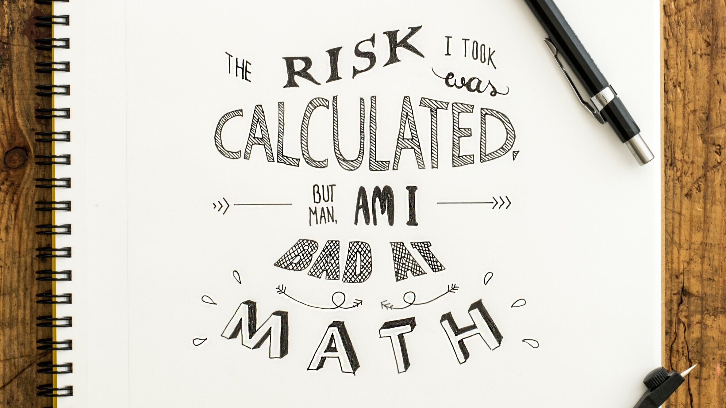
    Some fonts look better than others and if this is an integral part of your design, you will need to make sure it translates well on a t-shirt or sweatshirt. If you are struggling with finding the right way to properly visually represent your brand, typography is a great way to start, Typography can become a voice of design.

print+White+Sweater.jpg
  • Placement

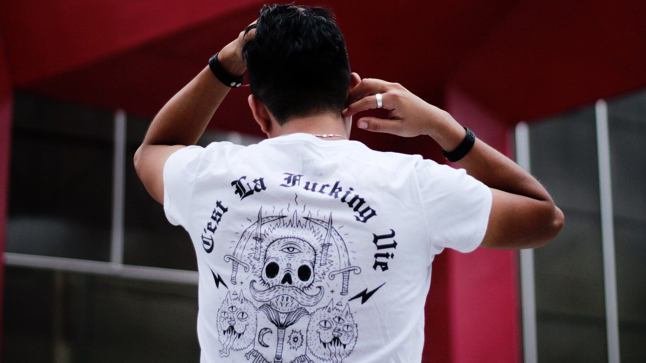
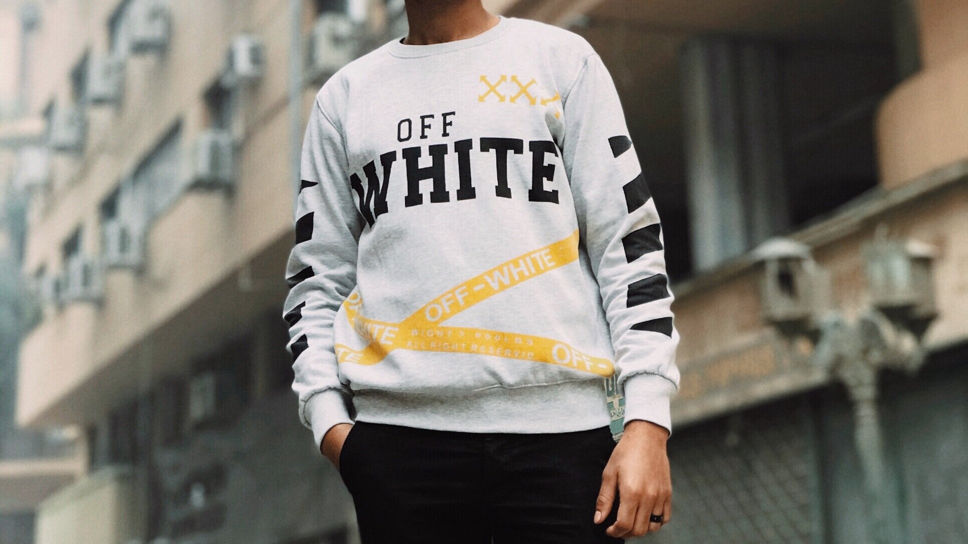
    With methods such as screen printing, there are a few options for placement. The most common areas are the center of the chest, left chest, full front, oversize front, upper back, center back, and full back. The placement, most of the time, will be determined by the design, the shape, or the purpose. If it’s important for the image or design to be visible, a center chest placement may be ideal. Other less common placements are the sleeves, sides, or back of the neck, which are increasingly becoming more popular among streetwear clothing brands.

Shirt-print-placments.png

Common Mistakes To Avoid

While you may have a great design ready to print, there are common mistakes people make when they are ordering t-shirts to be printed. Here an outline of some of those mistakes to avoid:

  • Sizing

    This is the most common and avoidable mistake people make when submitting a design to a print shop. The size of the artwork is important and vital as well as figuring out the cut of the t-shirt that the artwork will be printed on.


  • Placement

    This may seem straight forward, however, one common placement mistake is printing the design at belly level which is not flattering. Generally, when the artwork is submitted, the printer will advise on placement and adjust your file to the best fit. Alternative placements such as sleeves or sides are possible and your printer should be able to help you with such requests to ensure the design will translate properly.


  • Typography

    There are millions of font types, some better than others and not all will work for a t-shirt design. typography is the art of typesetting or arranging type in a way that makes sense, along with choosing typefaces (fonts) making sure that the spacing is correct, and the way it interacts with the graphic elements is aesthetically pleasing to the eye. Your font choice can say a lot about the way your design is received, and convey certain ideas or evoke emotions that may not be intentional. A good rule of thumb to ensuring your design looks good is to never use more than 3 different fonts in one design. Check this site to get a crash course in typography!


  • Composition

    Composition in terms of design is everything. Every design has elements that are arranged in relation to each other, and this relation is what makes up the overall composition. Some will say that composition is in the eye of the beholder, but there are certain rules to follow when creating a design. A typical mistake would be the spacing or the entire design could be off-balance, drawing the eye to the wrong thing. Here are a few resources to help you with composition.


  • Image quality

    Nobody wants a blurry design on their t-shirt and this is one big mistake people often make when they submit a file to the printer. To ensure your design or image is big enough and is high-quality, check the resolution (pixels). Ideally, images should be 200dpi or higher to guarantee a clear and detailed print.


  • Contrast

    Low contrast can lead to very hard to see designs against specific color t-shirts. If the contrast is off, your design won’t shine. So, what is contrast? It’s the degree of visual difference between the darker and lighter parts of an image, or the way shades of colors correspond to each other. The strongest contrast is between colors is black-on-white or vice versa. And of course, bright colors on a dark background are going to also be high contrast.


  • Details

    Fine details, small text, or very thin fonts can be difficult to discern on printed t-shirts. What might look good in black and white on paper or even on your high-quality phone screen can be hard or almost impossible to read on a t-shirt. Your design should have thick lines with also bold font or font that is big enough to translate well on a shirt.


  • Borders

    This mistake often happens when the design is a photograph. Designs that have a border can often look boring or cheap, that’s why it’s advised to take out any blank border from an image or design. Removing the border can make a huge difference and make the t-shirt more appealing to your customers. You may remove the background using photoshop, or if you don’t have photoshop, our team at Family Industries can help you.

    Author: Irene Floridia - Content Creator

Family Industries has experts standing by ready to help you with any of these roadblocks. We offer graphic design help and we also consult on print options. Click Here to Contact Us!